Basis Markets rebrand
The process behind Basis Markets rebrand as it relates to the logotype we use.
As many of you will have noticed our Twitter, YouTube channel, Discord server and website have been updated with the new basis.markets logo.
In this post we will cover the basis.markets rebrand and the process involved including some drafts and the reasoning behind these changes.
")
Ted sat down with our senior designer pixelgroove, the conversation provides insight into the design process and how Basis Markets aligned with its core brand proposition.
Pixelgroove chats about his career trajectory, the logo design process including fonts and symbols used, and how it culminated in the current brand design for Basis Markets. You can watch and listen to their conversation on YouTube.
The old logo
The initial branding was created in 2021, drawing on Basis Markets' original core function - Basis Trading. The old brand had buy-in from the community, but we wanted a more exciting look which stood out next to fellow projects in the Solana ecosystem.

The first step of a re-brand starts with knowing who you are and who you serve. Basis Markets is a decentralised finance (DeFi) company so it was important to align ourselves in the market with a look which represented this.
Most of the team have traditional finance (TradFi) backgrounds. We wanted to combine this with the innovation known for the DeFi space.
At the same time we did not want to lose the foundations of the old brand, in particular with the parallel lines representing a basis trade.
Drafts: 1st round
Maintaining the roots of the current brand and based on the brief provided to our senior designer pixelgroove, the first round of initial designs can be seen below.

The intention here was to be exploratory using the drafts to guide the team, giving aim to a visual style we explore later, but keeping in mind the old brand, as it was important not to deviate too far.
Symbol drafts
The distinct lines of the stripes in the symbol of the old logo provided a starting point to evolve into a more modern look.
We felt it represented a basis trade, the original purpose behind the project, allowing the innovation we desired without straying too far from the path.
The image below shows the progressive drafts of this exploration. The final symbol turned out to be more eye-catching and in colour.

Gradient drafts
There was a desire to reflect our presence in the Solana ecosystem and so, the “Solana gradient” is a bit of a trademark of its ecosystem. The team wanted to show a sense of familiarity within the space but remain individual so as not to be lost between other projects.
Even though we want to attract TradFi investors, we’re still a DeFi project at our heart, so it’s important to keep that sense of belonging to the space.

Font drafts
The old logo was in Courier New, a monospace font, so called because every character has the same width. It was originally created to give the idea of source code.
Monospace fonts are used in code editors like Notepad. They’re favoured by programmers because it keeps code aligned and leads to fewer bugs. 0 cannot be confused with O, brackets are distinct, etc.

Key takeaways from the first round of drafts:
- Bold and simple logo favoured (triangle)
- Evolution of stripe
- Monospace font clean look
- Bold fonts stand out
- Brand needs to reflect Solana ecosystem but also stand out
- Logo needs to work well in small sizes

Drafts: 2nd round
The triangle
- Crowded space: lots of logos with triangles
- Simple is better
- Does well in gradient and grayscale
- Holds well in smaller sizes (icon)


The triangle is a strong shape and it sits well with the idea behind the project but the team decided against developing this further because the space was crowded.
There are a number of projects using a triangle as the symbol in their logos. One of them was the Delta protocol.
We wanted to stand out, not be like everyone else.
The stripes
- Evolution from old symbol
- Stands out in the solana ecosystem
- Not as strong in smaller sizes
- Does well in gradient and grayscale


We decided to explore stripes further because they are representative of the project. The opposing forces of up (long) and down (short) of a delta neutral position.

Sometimes logos feel a bit off and that is for the lack of harmony between symbol and text. However, the symbol + text combination (in the image just above) was working so well that we picked the centre bottom half draft of the above image.
Pivot required
The community pointed out that the basis logo had some similarity to the Nasdaq logo. We had no intentions to make it look similar, in fact we didn’t think it was similar.
While it could bear some resemblance, at the same time we felt it was distinct enough to stand on its own. There was also the benefit of having TradFi people feel at home with the familiar look in this draft.

The radio was invented by two people at the same time in History, without knowing what each other were doing, long before the internet.
These days we’re bombarded with ads and images of brands that work its way into your mind. There's bound to be a lot of creative work that feeds off of each other unintentionally.
Still, we decided to pivot and refine the symbol which we’ll go into later.
Drafts: 3rd round
This round was focused on typography.
The font
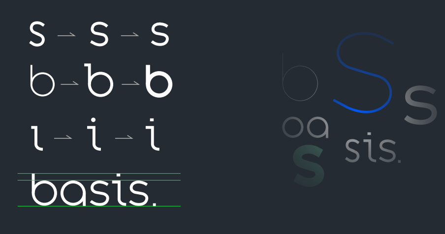
We pulled several different fonts, looked at characters we liked in each and drew them together to create a custom logotype.

The text looks clean and has what we originally intended it to represent. There’s the prominent “b” that we can use as a design element and the “i” that draws the eye and gives a nod to monospace fonts.
The drawback was the “s” that didn’t look quite right. Our designer pixelgroove fixed the “s” and tidied up the “i” so the spacing became much cleaner.

The colours
Initially the classic Solana gradient with the purple and green was a popular combination. We were going that route as well but realised we’re not a purely Solana project.
Basis Markets is going cross-chain ( Ethereum, Avax, etc) in the future and we do quite a few different things. It wouldn’t make sense to align ourselves purely with the Solana ecosystem.

The Solana ecosystem already had plenty of purple to go around. We would need to really drill down to get the colour combinations to reflect what the project represents.
At the same time we wanted to keep the blue. Colours like blue are a nod to the TradFi space so it was important to keep that feel.
Eventually we settled into a focus on blue gradient combinations, moving away from the purples and greens of other protocols.

The symbol
With the right colours done, we still had to work on the symbol to avoid the Nasdaq logo comparison.
We didn’t think they were similar as some users commented, but we still decided to tweak it further to avoid comparisons with other projects.
The symbol consisted of strong diagonal thick lines. This was to represent the up and down of the market as it relates to a basis trade with its funding payment rates.

We wanted to keep that feeling but make it less rigid, so we rounded the shape. Making the shapes rounder gives a softer look that goes well with the text portion of the logo.
The final logo
The end result. We believe the symbol and text combination works really well together.

Conclusion
A survey found that companies with a clear brand proposition tend to do better than those that didn’t over a 10 year period. Even if their sales and lead generation failed, they would still grow if they had a strong brand.
People make decisions with whatever they purchase or invest money based on a number of factors, a key one of them being visual.
As human beings we rely on our visual sense. We are drawn to how things look and make us feel. When the finesse and attention to detail is there, it creates a trustworthy feeling for the brand.
That’s where design comes in. It helps facilitate the visual trust people have on your brand. This is especially important in the crypto space where trust can be low in times of uncertainty.
So, there you have it, an in depth look at our rebrand evolution and the justification behind the changes made.